Agata Kurzela Studio reveals their AD Government office project
AD Government Office designed by Agata Kurzela Studio
Abu Dhabi, United Arab Emirates
AD Government Office
Agata Kurzela Studio gives details of their project.
Project description
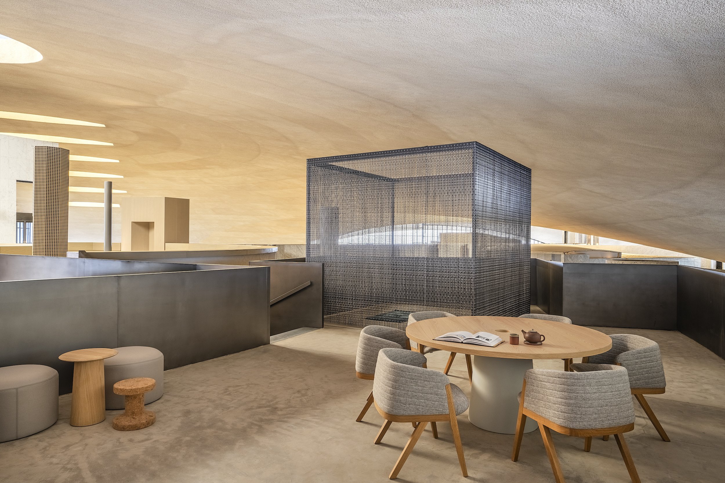
This space is under a dramatic undulating roof, on the last level of a heritage building. It had been designed for a government body overseeing major public projects that also hosts workshops and exhibitions. A key challenge was the fluctuating office occupancy because of varying numbers of external consultants.
Rediscovering the building’s architectural qualities, its genius loci, was at the core of this concept. We focused on the clarity of the previously underutilized space, and re- established its logic through an addition of volumes that pay homage to the architectural proportions in an act of creative archeology.
Design details
We aimed to reflect the organisation’s mission, forward-looking yet rooted in Emirati heritage.
While the original brief called for an open workspace, private offices and
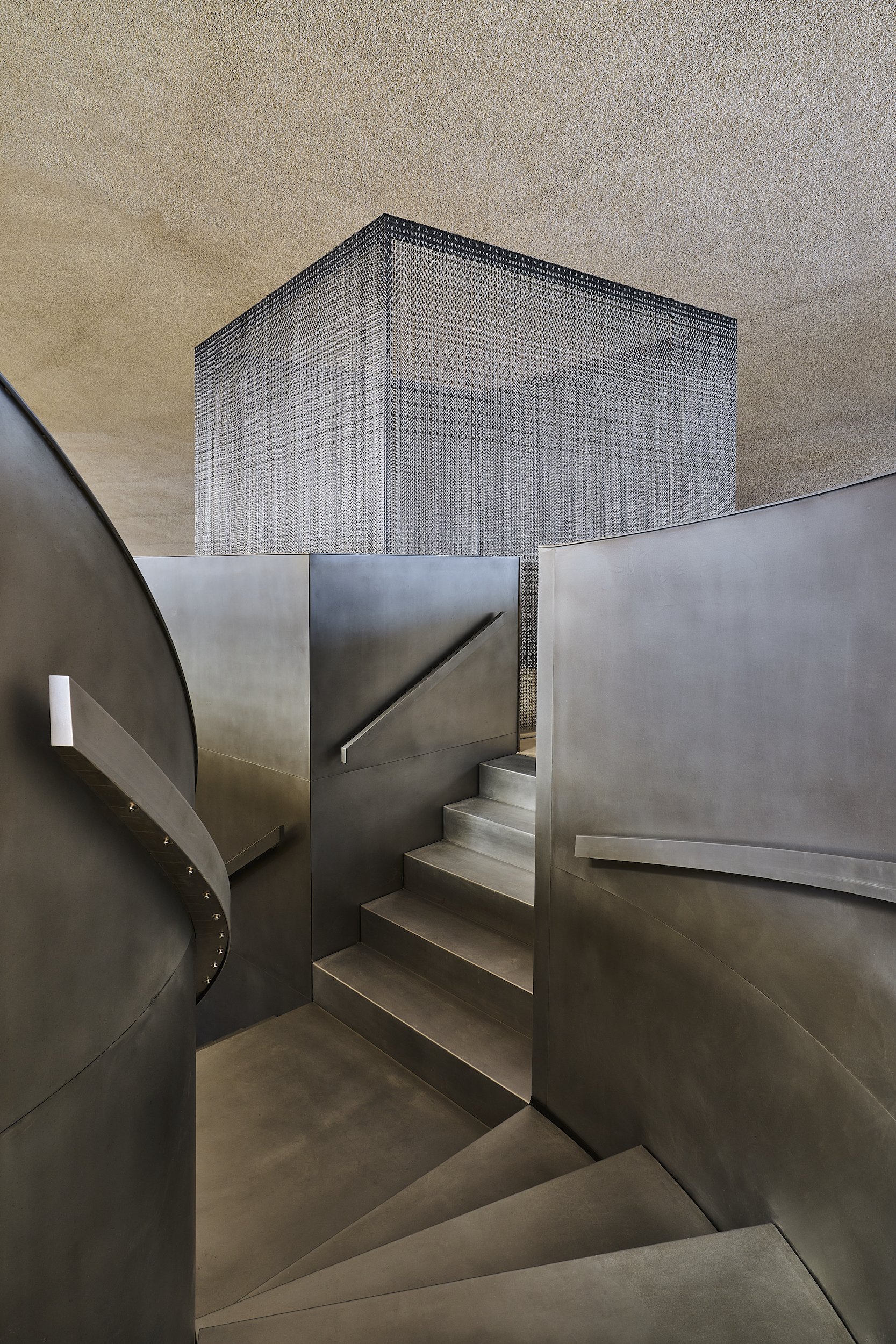
meeting rooms, the project eventually increased three-fold to add several flexible working areas, a boardroom, a library, prayer rooms, a hot desking zone and phone booths. Once the ambitions outgrew the available space, we expanded vertically, by adding functional platforms interconnected by staircases. Extensive three-dimensional studies determined multiple connections between levels.
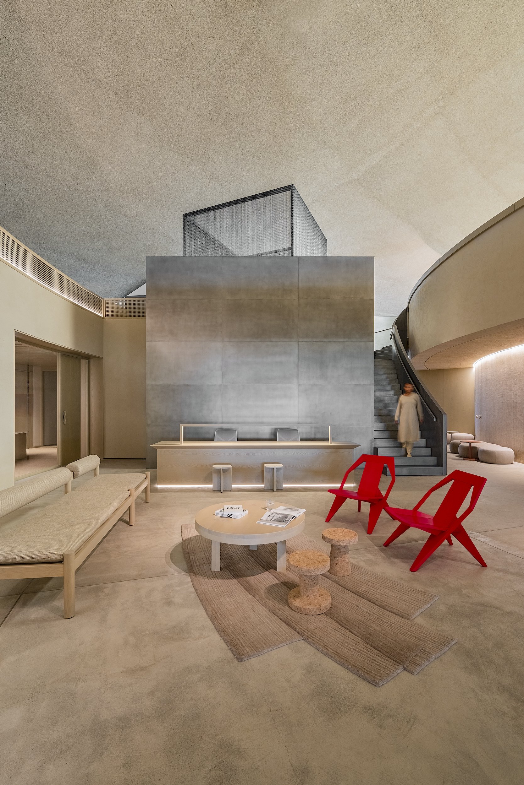
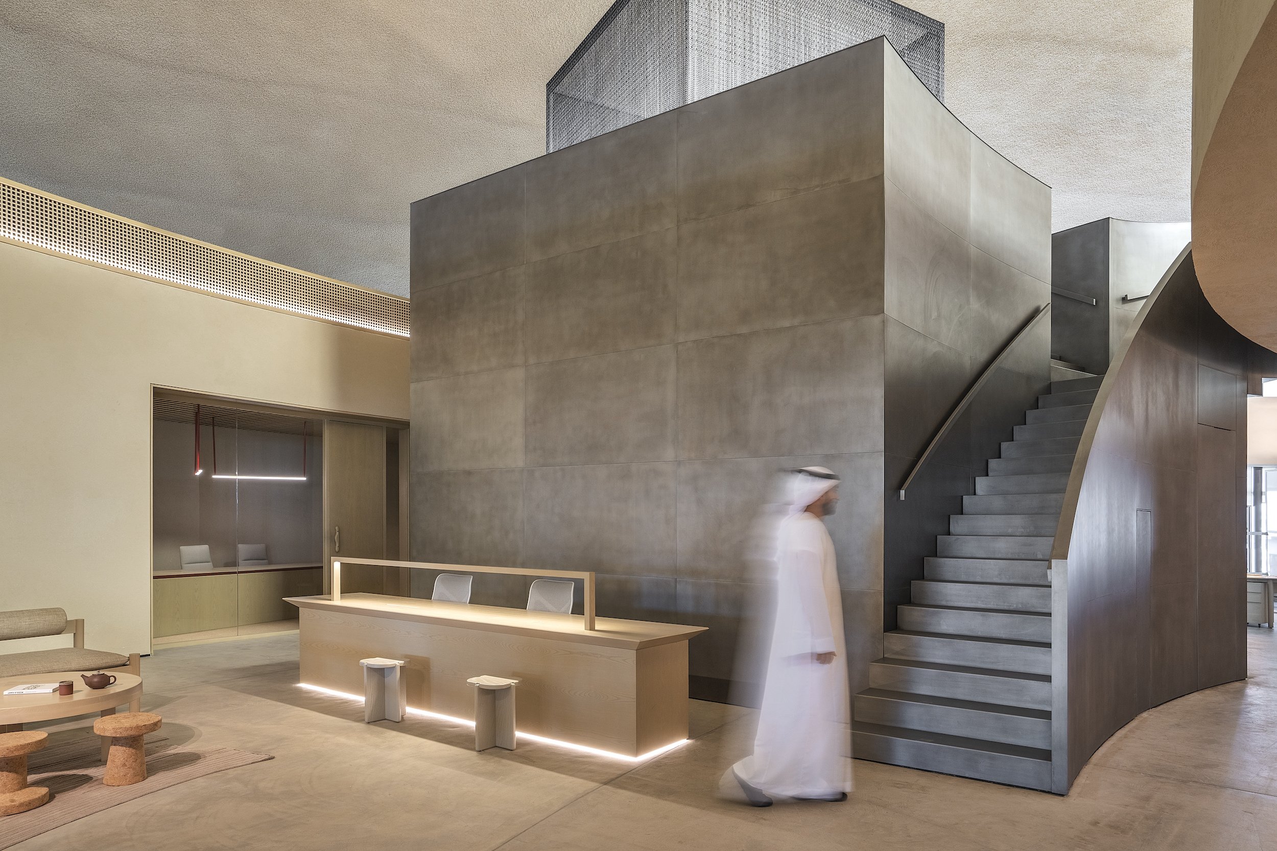
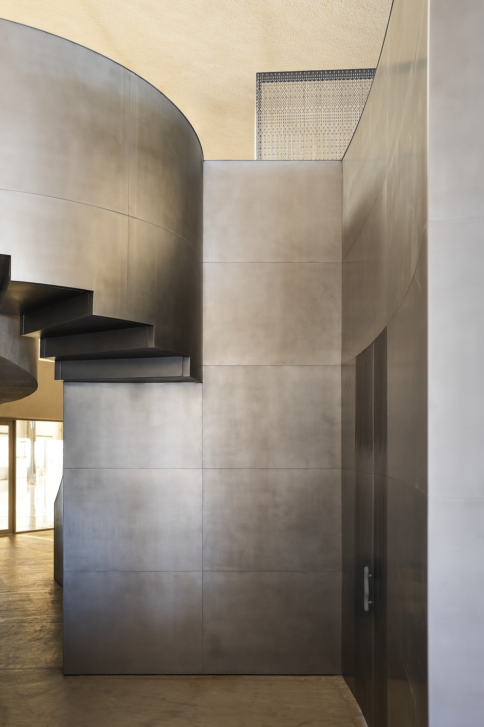
The new volume near the entrance, made of mild steel, creates a connection to the exhibition level, with a meeting lounge and male prayer room accessible through an alternative stair flight where the staircase splits. The imposing volume, concealing a ladies’ prayer room and an office, is echoed by a smaller cube perched on its top – proportioned to be half the size and half of the opacity through the use of suspended aluminium chains. The bold sculptural element creates a beacon that signals the entrance and brings order to multiple competing geometries of the original building.
The complexity of the original space had its unexpected benefits. Thanks to multiple entry points, including access from different levels, the journey can vary depending on the user. Visiting dignitaries may arrive directly from the main building entrance to the exhibition area via the lift and descend to the boardroom. Alternatively, they may be welcomed with refreshments in the workshop area, all without disturbing the employees in the open office.
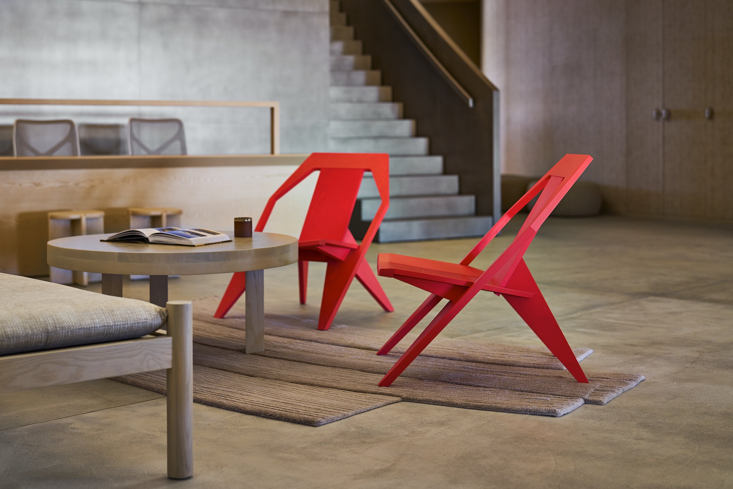
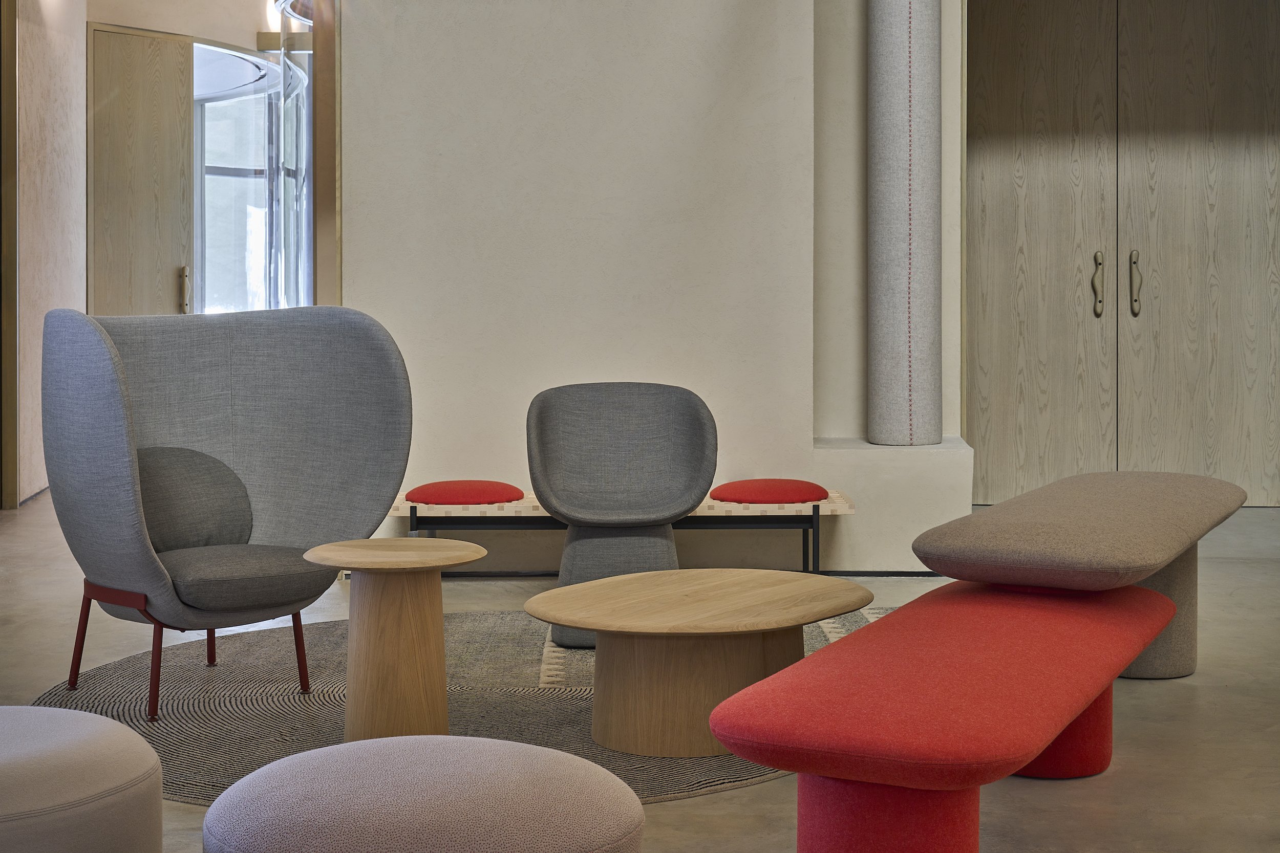
The palette of materials was developed in harmony with the branding, stressing the creational power of words, symbolically expressed through red accents against neutral shades of paper and sand. We used contrasting materials: rough plaster, widespread in traditional architecture, and woven palm mats known as safeefah, paired with sleek and patinated mild steel.
Innovative elements
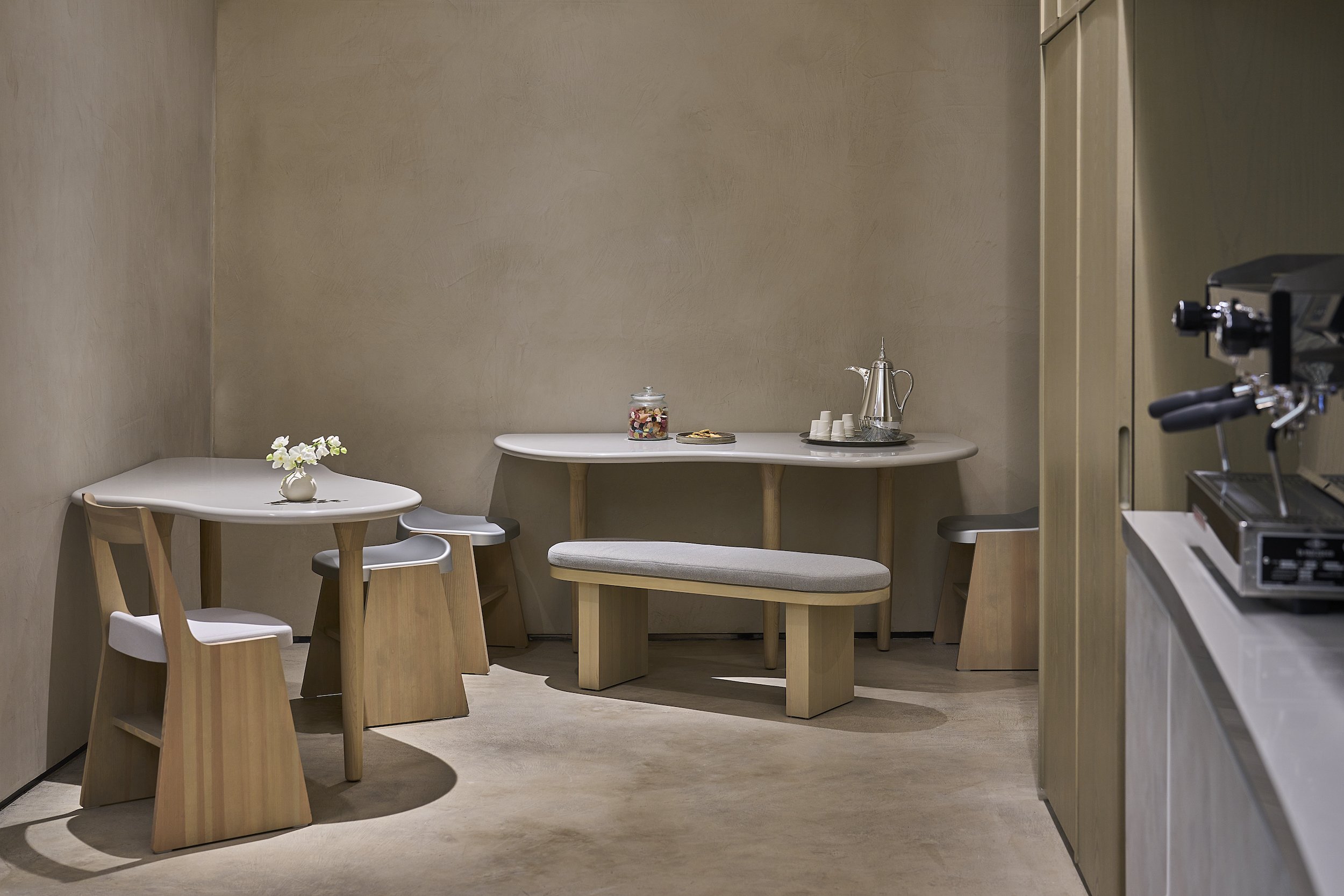
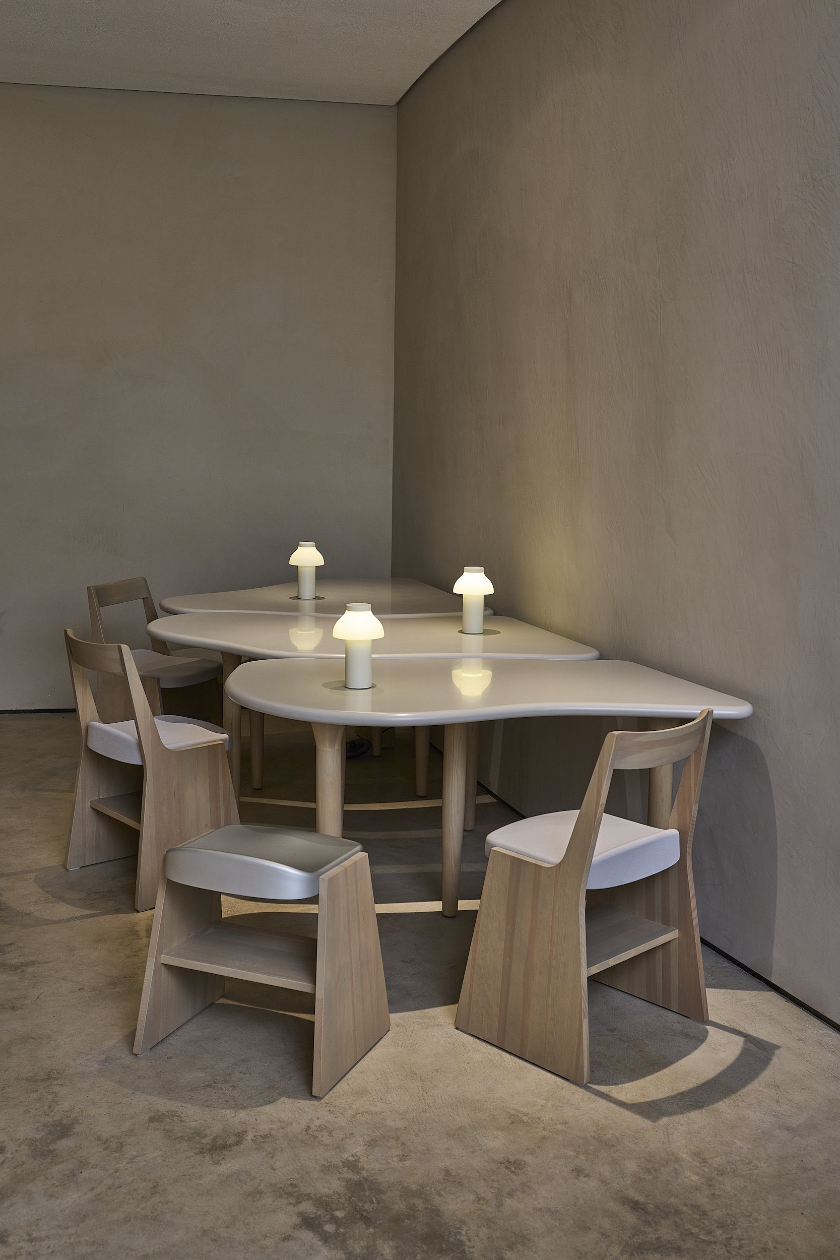
Instead of fighting the irregular shapes, we drew inspiration from them. We designed a nesting system that can be playfully reassembled for the pantry tables, located in a narrow and curved space.
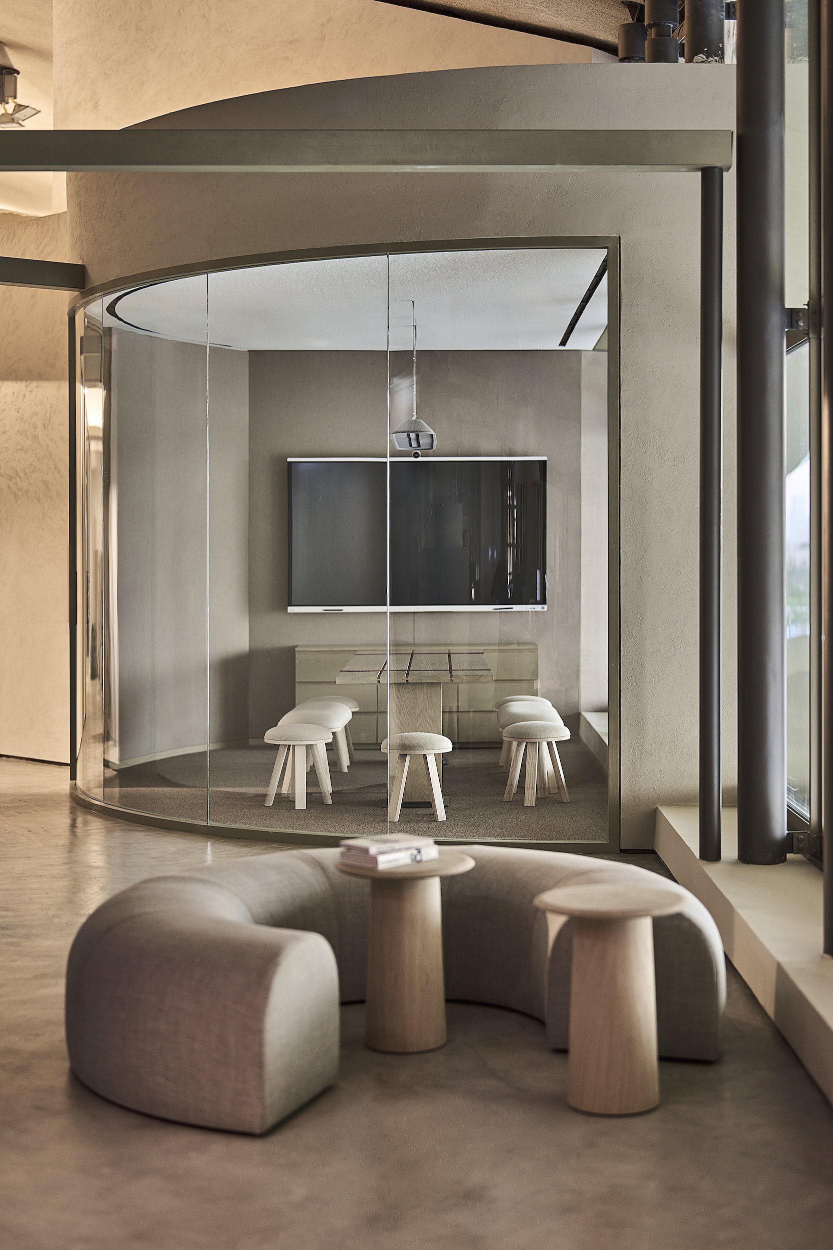
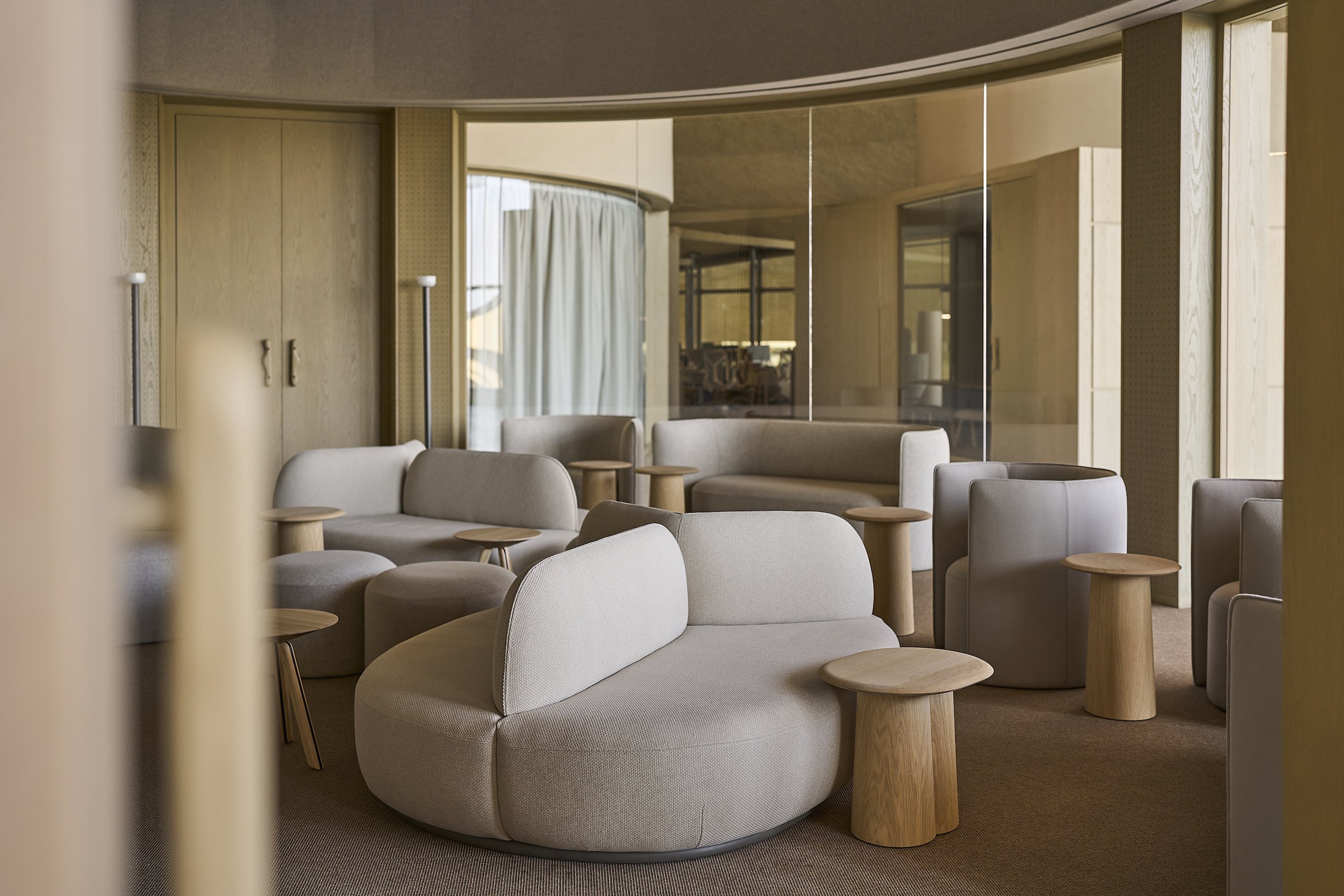
The space is flexible, geared up for different teams who can rearrange it with the spanning structures that can hold partitions and reconfigurable modules: acoustic pin- up boards, magnetic white-boards and storage units. The furniture has been designed in a way that allows setting up for smaller or bigger groups working together on common projects.
As our challenge, we took upon ourselves to completely conceal the air-conditioning outlets – no grilles are visible, with the exception of the existing free-standing totems on the exhibition level that were retained to avoid wasteful rework but were refinished in a minimalist timber grid.
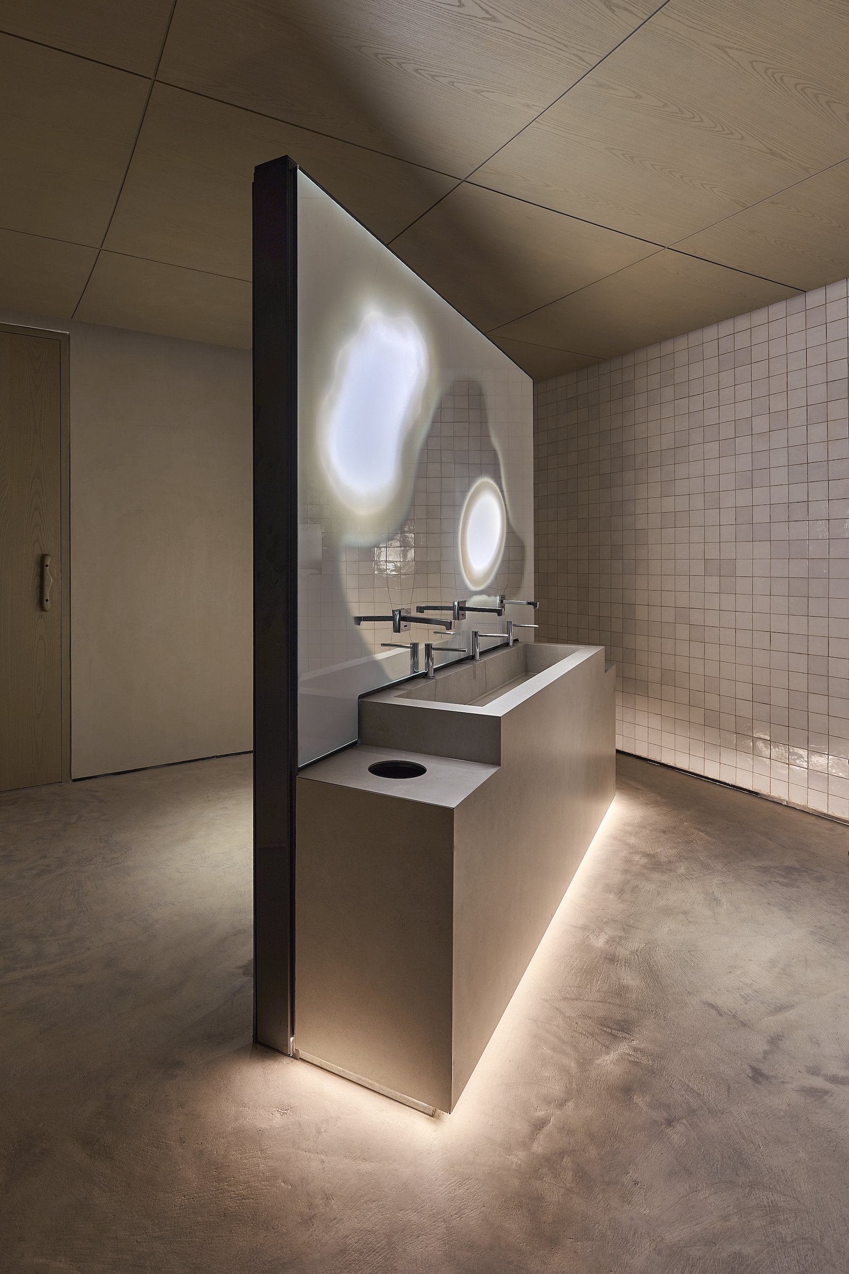
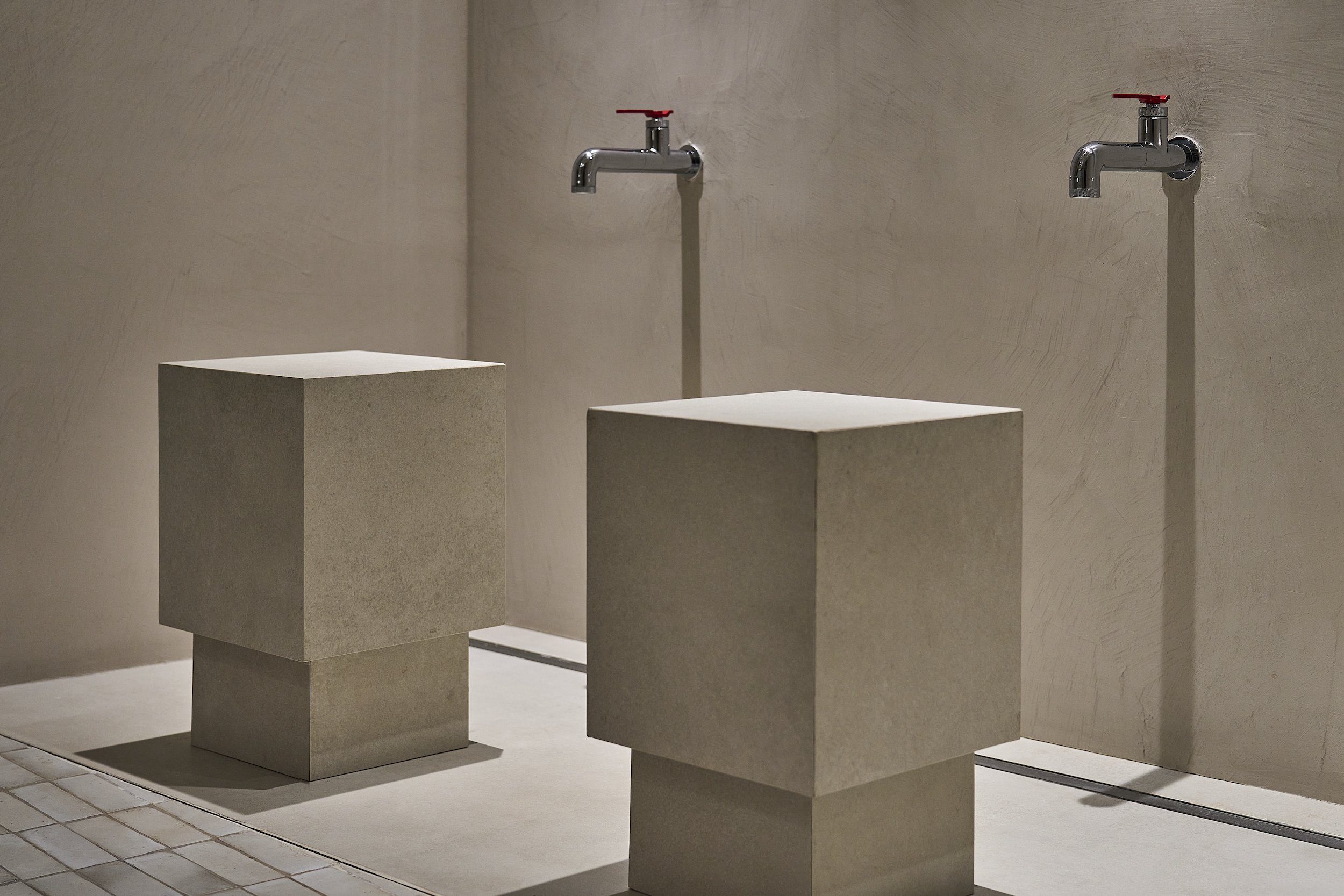
For the washrooms, we divided the space diagonally with free-standing vanities in order to provide privacy while avoiding additional airlocks. The vanity mirrors, produced locally, combine a complex of translucent, reflective, and matt surfaces within a single pane, developed through a painstaking prototyping process.
Executive areas use switchable glass glazing for the glass partitions, transparent or opaque based on requirements. The usage of super-thin LED light strings designed by Davide Groppi, spanning up to 17 meters, allowed illumination of areas where recess lights in walls, floors or ceilings was impossible.
Previously inaccessible gravelled roofs have been resurfaced and given access to serve as breakout areas. The project added spaces for prayer rooms, ablution areas and nursing rooms.
Design purpose
The guiding principle of our client is to be “focused on our people and grounded by our human values”. The design followed this path by providing a user-centric and culturally responsive space.
Daylight is a critical factor in the design approach. We avoided creating obstacles to the light, one of the reasons why the entrance volume boasts translucent prayer room – one of the two prayer spaces created due to the remoteness of the mosque.
Flexible spanning systems that connect the central volume with the façade permit rearranging the open workspace as teams focus on different projects. An existing intrusive ledge running along the principal façade was converted to a
linear majlis meeting room, with seating modules that can be placed on top. Impromptu exchanges are encouraged thanks to multiple lounges and meeting areas. Phone booths are scattered throughout to allow for privacy.
Acoustics were thoroughly considered – from absorptive walls and ceilings, tailored to each space’s aesthetics, to free-standing acoustic panels.
We produced locally when possible to support local businesses. Furniture by local designers was used in the executive areas and cushions were woven by Emirati artisans, part of a collective that focuses on preservation of traditional skills, using a technique call sadu. The reception volume and staircases were made from recycled mild steel by a local manufacturer. The acoustic glass partitions were also produced locally.
A decision against adding ceilings above the open offices helped minimise the material waste and let through the daylight. We used FSC-certified timber and recycled wood- wool in corridors. Acoustic fabric panels are made from rapidly renewable materials and are certified for indoor air-quality.


